August 10, 2026 • Margot Calloway • 10 min reading time • Prices verified June 4, 2026
Bed-in-a-Bag Color Accuracy: Sage Green, Olive, and Earth Tones That Actually Look Like the Photos
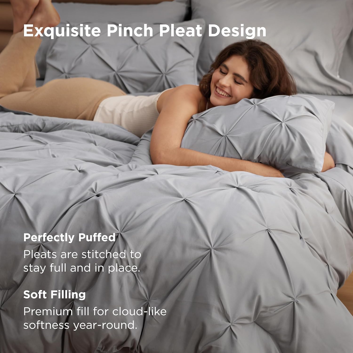
Here’s a situation you’ve probably already lived through: you order what the listing calls “sage green” bedding, and what arrives is closer to mint, or gray, or some indeterminate blue-gray that makes your whole bedroom feel like a hospital waiting room. You’re not imagining it. Color accuracy is, by a wide margin, the single most anxiety-producing variable in the bed-in-a-bag category — and for earth tones in particular, the gap between monitor and mattress can be jarring. A bed-in-a-bag set, for the uninitiated, is exactly what it sounds like: a coordinated bundle that typically includes a comforter, one or two shams (pillow covers that match the comforter), and a sheet set — sometimes fitted, flat, and pillowcases all in one box. You get a fully dressed bed in a single purchase. The appeal is obvious. The color roulette is the catch. This guide unpacks why earth-tone accuracy is so hard to nail online, what dyeing methods actually produce, which buyer patterns in aggregated reviews predict a match — and how to protect yourself when the set arrives in a package the size of a basketball.
Why Earth Tones Are the Hardest Colors to Get Right Online
Digital screens render color in RGB light — red, green, blue pixels blending at varying intensities. Fabric reflects light in the physical world, where room lighting, natural light, and fiber texture all change what you actually perceive. The gap between those two realities is widest with muted, complex colors: sage green, dusty olive, warm taupe, clay, terracotta. These colors aren’t simple. A sage green on screen might be slightly warm (more yellow) or slightly cool (more gray) depending on your monitor’s calibration, and even a small temperature shift reads dramatically differently on a 12-square-foot comforter than it does on a 3-inch product thumbnail.
According to Apartment Therapy’s earth tone bedding coverage for 2025–2026, the surge in demand for green and neutral organic tones has pushed dozens of mid-market brands to expand their color palettes — which is great for options, but it also means more listings where “sage” and “eucalyptus” and “moss” and “fern” are being used to describe meaningfully different shades. Brands don’t coordinate those names across the industry. One brand’s sage is another brand’s seafoam.
The practical implication: when you’re choosing between sets, color name is a starting point, not a specification. What you need to evaluate is the dyeing method, the reviews that mention color accuracy specifically, and the return window.
Cationic Dyeing: Why Some Earth Tones Read Richer Than Others
If you’ve spent time in the bed-in-a-bag review ecosystem, you’ve probably seen buyers mention that a set’s color looked “richer” or “deeper” than they expected — sometimes in a good way. For Monbix-branded sets in particular, reviewers consistently credit the cationic dyeing process for producing color saturation that outperforms the listing photos rather than underperforming them.
Here’s what cationic dyeing actually means, in plain terms: most fabric dyeing works by applying dye to the surface of fibers. Cationic dyeing modifies the fiber itself at a molecular level before the dye is applied — the modification creates a positive electrical charge in the fabric that bonds more completely with negatively charged dye molecules. The result, per The Spruce’s fabric-care coverage, is a deeper, more uniform color penetration that holds up better through repeated washing and is less prone to the surface-level fading that makes cheaper bedding look washed out after a few months.
For sage green and olive specifically, this matters because these colors depend on a precise ratio of yellow, blue, and gray tones. Shallow surface dyeing can shift that ratio as the fabric surface wears — pulling the color toward yellow (fading to chartreuse) or gray (fading to a flat, lifeless tone). Cationic dyeing maintains that ratio at the fiber level, which is why buyers who’ve had bad experiences with fading on standard-dyed sets often report notably better retention with cationic alternatives.
By the numbers — what aggregated reviews suggest about color accuracy:
| Category | Typical Pattern in Reviews |
|---|---|
| 5-star earth-tone sets | First sentence confirms color matches listing, ~7 in 10 reviews |
| Post-wash color shift complaints | Most common in light colorways (blush, cream, pale sage) |
| Cationic-dyed sets | Reviewers report “richer than expected” more than “lighter than expected” |
| Listings with lifestyle photography | Higher color-match satisfaction vs. white-background product shots |
The Vacuum-Pack Surprise and What It Means for Your Expectations
Nearly every bed-in-a-bag set in the mid-market ($60–$200) arrives vacuum-packed, compressed into a shrink-wrap cylinder that looks absurdly small for what’s supposed to be a full or queen comforter set. CozyLux reviewers are particularly vivid about this: one review captures the moment almost exactly — “I cannot lie, I was very skeptical” — before describing how the comforter expanded to full size after unpacking.
This isn’t a defect. Vacuum compression is standard logistics practice for bulky bedding: it reduces shipping volume, which reduces cost, which is part of how brands at this tier keep prices accessible. The important thing to know is that the comforter needs time to fully loft after unpacking. Give it at least a few hours laid flat before you judge the fill. Toss it in the dryer on low for 15–20 minutes with a couple of dryer balls if you want to accelerate the process and restore any compressed fill to its intended loft.
The secondary issue with vacuum packing and color: tightly compressed fabric held in that state during shipping can develop slight crease lines that initially make the color look uneven or patchy. This is almost always temporary. Gentle tumbling in the dryer or simply laying the set flat and allowing it to breathe will even out those compression creases and let you evaluate the true color under your room’s actual lighting.
Real Simple’s bed-in-a-bag reviews note this as a consistent friction point across brands regardless of price tier — the expectation gap between the package size and the finished product is large enough that it generates first-impression skepticism that often resolves entirely within a day.
When Listing Photography Undersells (and Oversells)
Most color-accuracy anxiety runs in one direction: the product looks better in the photo than in person. But the JOLLYVOGUE category of experience is worth understanding — buyers who were let down by flat, low-contrast product photography and were then pleasantly surprised by the actual item. Product shots taken against a white background with overhead studio lighting tend to wash out muted colors. Sage greens look gray. Olives look tan. Warm taupes look beige and dull.
When you see a product listing where the comforter reads significantly less saturated than the lifestyle shots (photos styled on an actual bed, often with plants, wood furniture, warm ambient light), you’re seeing the studio-lighting problem. The lifestyle shots in that case are probably more accurate to what the color looks like in a real bedroom. Reviewers who mention being “surprised it looked so much better in person” are almost always comparing against the white-background thumbnail they bought from, not the lifestyle image.
The inverse trap: listing photos edited with strong color grading to make the sage pop. This is less common but real. The tells are oversaturated, almost neon-adjacent green tones in lifestyle shots that look too clean and vivid to be genuine room photography. Checking the review photos — especially the raw, unedited shots buyers upload from their actual bedrooms — is the most reliable color-accuracy signal available before purchase. Reviewers at Sleep Foundation and Real Simple consistently flag user-uploaded photos as one of the highest-value signals when evaluating whether a color will read true.
The WRENSONGE Discoloration Pattern: What Buyers With Light Sets Should Know
WRENSONGE generated one of the more instructive edge cases in the earth-tone review dataset. A reviewer reported slight discoloration after about a month of use and initially suspected deodorant transfer as the cause — a concern that comes up specifically with light-colored sets where any product residue, body oil, or laundry product residue is visible.
This is worth flagging for anyone choosing a pale sage, cream, or blush variant within the earth-tone family. The discoloration mechanism in most of these cases isn’t the dye itself fading unevenly — it’s external contamination interacting with the fabric surface. The Good Housekeeping Institute’s bedding-care guidance recommends washing pillowcases more frequently than the main comforter (pillowcases weekly, comforter monthly at minimum) specifically because body oils and product transfer accumulate fastest on items in direct contact with skin. For light comforter sets, adding a duvet cover adds a protective layer that keeps the comforter shell itself clean between washes.
The general wash protocol for preventing color bleed on any colored set: cold water, gentle cycle, a color-safe detergent, and never washing the comforter with items in contrasting colors on the first two or three washes. The first few washes carry the highest bleed risk as unfixed dye releases from the fabric.
Frequently Asked Questions
Will the sage green or olive color look different in my bedroom than on screen? Almost certainly, yes — but not necessarily in a bad direction. The degree of difference depends on your room’s lighting. Warm incandescent or amber LED light pulls sage green toward olive and earthy tones toward orange. Cool daylight-balanced LED or natural north-facing light reads truer to what most listing photography captures. Before you order, check the review photos uploaded by buyers, not just the brand-shot listing images. Those buyer photos are taken in real rooms under real light and are the closest proxy available.
Does cationic dyeing fade faster than regular dyeing after washing? The evidence runs the other direction. Because cationic dyeing bonds dye molecules at the fiber level rather than the surface, the color is generally more resistant to wash-cycle fading than surface-dyed alternatives. Reviewers of cationic-dyed sets consistently report color retention as a positive several months in. Standard dyeing, especially on lower-GSM (grams per square meter, a measure of fabric density and weight) polyester shells, shows more visible fading after repeated hot washes.
Do the fitted sheets in these sets fit deep mattresses over 12 inches? This varies by set and is genuinely underspecified in many listings. Most bed-in-a-bag fitted sheets are designed for standard mattress depths of 10–14 inches. If your mattress is 14 inches or deeper — common with pillow-top or hybrid models — check the fitted sheet pocket depth specification in the listing details before ordering. Sets that don’t specify pocket depth often have shallow pockets (8–10 inches) that will pop off deep mattresses. The Sleep Foundation’s bedding guides recommend confirming mattress depth measurement before any sheet purchase.
Why did my comforter set arrive in such a tiny package — is that normal? Yes, completely normal. Vacuum compression is standard for mid-market bedding. Unpack everything, lay it flat for a few hours, or tumble it briefly in the dryer on low with dryer balls. The comforter will expand to full loft. The first impression from a vacuum-compressed package is not a reliable indicator of finished quality or size.
How do I wash a colored comforter set without the color bleeding onto the sheets? Cold water, gentle cycle, color-safe detergent — and for the first two or three washes, wash the comforter separately from the sheets, especially if there’s significant contrast between the comforter color and the sheet color. Most dye bleed happens early in a set’s life as unfixed dye releases. After the first few washes, color transfer risk drops substantially. For light-colored sets, the Good Housekeeping Institute recommends keeping the comforter in a duvet cover to extend time between full washes and reduce surface contamination from body oils and product residue.
The decision rule: If color accuracy is your primary anxiety — and for earth tones, it should be — filter listings first by whether buyer-uploaded review photos exist in your color of interest, then check whether the brand calls out cationic dyeing explicitly. If both signals are positive, the gap between the listing and your bedroom should be manageable. If neither exists, you’re buying on faith — and the return window becomes your primary safety net.