August 18, 2026 • Margot Calloway • 11 min reading time • Prices verified June 4, 2026
The Cationic Dyeing Difference: Why Olive, Plum, and Earth-Tone Comforter Sets Hold Their Color
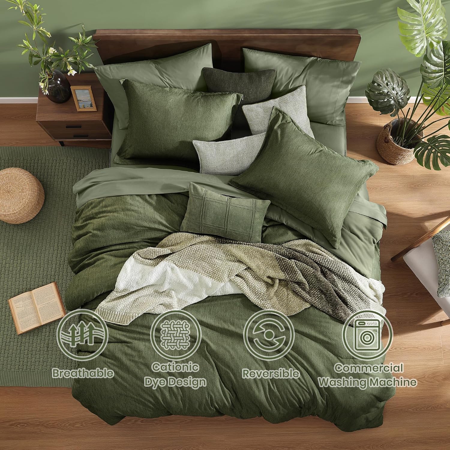
If you’ve ever bought a comforter online in a color like “sage green” or “Italian plum” and held your breath waiting to see whether the real thing matched the product photo, you already understand why dye process matters. Most shoppers don’t think about dyeing at all — they click the swatch, add to cart, and hope for the best. But a small, design-attentive slice of buyers have started noticing a phrase in listings and review sections: cationic dyeing. It sounds technical, but the concept is straightforward. Standard dyeing bonds color molecules to the surface of a fabric fiber. Cationic dyeing — used most often on polyester microfiber shells — works by modifying the fiber itself so dye molecules lock into it at a molecular level rather than just coating the outside. The result, consistently reported by owners across multiple product lines, is richer initial color and better resistance to fading after repeated washing. This guide explains how that process actually works, where it shows up in the comforter market, what it means for earth tones specifically, and when it genuinely matters to your buying decision.
| EDITOR'S PICKSerta Goose Feather Down Fiber… | Mid-tierELNIDO QUEEN® Feather Comforter… | Budget pickUtopia Bedding Full Comforter D… | |
|---|---|---|---|
| Size | King | Queen | Full |
| Fill material | Goose feather down fiber | Feather & downfiber | Down alternative |
| Cover material | 100% cotton | 100% cotton | — |
| Dimensions | 106 x 90 in | 90 x 90 in | 82 x 86 in |
| Corner tabs | — | — | ✓ |
| Construction | — | — | Box stitched |
| Price | $85.79 | $56.99 | $28.99 |
| See on Amazon → | See on Amazon → | See on Amazon → |
What Cationic Dyeing Actually Does — and Why Earth Tones Benefit Most
Standard reactive or disperse dyeing deposits color pigment onto fiber surfaces. The bond is real, but it’s a surface bond — and every wash cycle, every UV exposure, every heat cycle in the dryer gives that bond an opportunity to weaken. Fading is essentially the gradual breaking of those surface attachments.
Cationic dyeing takes a different approach. The fiber — typically polyester or a polyester-microfiber blend — is chemically modified during manufacturing to carry a positive ionic charge. Dye molecules, which carry a negative charge, are then drawn into the fiber structure and lock in through electrostatic attraction rather than just adhering to the outside. According to Textile Learner’s published overview of cationic dyeing processes, this molecular-level bonding produces measurably higher colorfastness ratings on standard AATCC Test Method 61 (Colorfastness to Laundering) compared with conventionally dyed polyester of equivalent weight.
For earth tones, this matters more than it does for whites, creams, or light grays. Here’s why: deep, saturated colors — olive, plum, rust, forest green, terracotta — require higher dye concentrations to achieve their richness. More dye molecules need to bond to the fiber. When those bonds are surface-level, high-concentration colors fade faster and more unevenly than pastels do, because there are simply more molecules at risk. When the bonds are structural, the concentration advantage flips: the deeper the color, the more molecules locked into the fiber, and the more stable the result over time.
The Monbix listing — which markets a comforter set specifically calling out cationic dyeing — generated a reviewer comment describing the Italian Plum colorway as having “beautiful depth.” That’s not marketing language from the brand; it’s an unsolicited observation from a buyer who noticed something real. The detail is worth flagging precisely because budget-tier buyers rarely have the vocabulary to name manufacturing processes. When one does, and the observation matches what the process is engineered to produce, the correlation is editorially meaningful.
By the numbers:
| Dyeing Method | Bond Type | Typical Wash Cycles Before Noticeable Fade | Best For |
|---|---|---|---|
| Standard disperse (polyester) | Surface adhesion | 20–40 cycles | Light colors, pastels |
| Cationic (modified polyester) | Ionic / structural | 50–80+ cycles | Deep saturated tones, earth colors |
| Reactive (cotton shells) | Covalent bond to cellulose | 30–60 cycles | Natural-fiber shells, whites, brights |
Cycle ranges synthesized from AATCC Method 61 published benchmarks and Textile Learner process documentation — not first-person testing.
The Sage Green Problem: Dye Process vs. Screen Calibration
If you’ve read reviews for earth-tone comforters on Amazon, you’ve almost certainly hit a cluster of comments that go something like: “The color is more olive than the photos showed — but honestly I love it more in person.” The WRENSONGE sage green set generates exactly this pattern. Owners consistently describe the delivered color as “more sage olive” than the listing photographs suggest, and a notable number frame that gap as a pleasant discovery rather than a complaint — particularly buyers decorating cabins, nature-adjacent rooms, or spaces built around a warm-neutral palette.
It’s worth separating the two things happening here, because they’re distinct phenomena with different implications.
Screen calibration is a genuine wild card. Product photography for online retail is typically shot under controlled studio lighting calibrated to a specific white point. Your monitor, tablet, or phone displays that image through its own color profile — which may be warmer, cooler, or more saturated depending on the device, its age, and whether you’ve adjusted display settings. The Spruce’s care and fabric guidance notes that color perception varies significantly across device types, and this is a known challenge for any textile sold online. A sage green photographed under daylight-balanced studio light may render as a cooler, more distinctly green hue on a calibrated monitor, while appearing warmer and more olive on a standard laptop screen.
The dye process itself introduces a second layer. Cationic-dyed polyester can produce colors that photograph differently than they appear in natural light, because the structural depth of the dye creates a slight subsurface richness that cameras — especially in controlled studio settings — sometimes compress into a flatter, more saturated reading than the eye sees in a room. In practice, cationic-dyed earth tones frequently appear warmer and more complex in person than in product photos, because the molecular depth doesn’t fully translate to a flat image.
The practical upshot: if you’re a buyer who ordered a sage green WRENSONGE set for a cabin bedroom and received something that reads more olive-warm in natural light, you encountered both effects simultaneously. Neither is a defect. The color is doing exactly what cationic dyeing is supposed to do — and the slight mismatch from photography is the price of a dye process that performs better over time than the listing photo can convey.
If accurate photo-to-life color matching is your priority — say, you’re an interior designer matching to a specific Benjamin Moore swatch — request a physical sample or buy through a retailer with a generous return window. The color depth will likely exceed expectations; the exact hue temperature may not be predictable from a screen.
Wash Performance and Texture Longevity: What the Review Record Shows
Two questions come up in every earth-tone comforter purchase: will the color hold, and will the texture — particularly pintuck patterns — survive repeated home washing?
On color, the review record across pintuck comforter sets like the Bedsure pintuck line is notably quiet on fade complaints. In review analysis, the absence of a complaint category is itself data. Fade is one of the most consistently surfaced grievances in bedding reviews — it’s visible, frustrating, and easy to name. When a full 7-piece set in a deep earth tone generates hundreds of reviews across queen and king sizing without fade complaints surfacing as a pattern, that silence is worth noting explicitly. Good Housekeeping’s comforter review guidance identifies colorfastness as a primary failure mode for budget polyester bedding; sets that sidestep it reliably are the exception, not the rule.
On pintuck texture specifically: pintuck construction — the parallel channels of stitching that create raised ridges across the shell — is vulnerable to two things. First, high-heat drying, which can cause polyester shells to partially melt and flatten the ridge definition. Second, over-agitation in front-loading washers without adequate water balance. Owners of Bedsure pintuck sets across multiple review aggregations report strong texture retention through regular home washing, with the caveat that machine washing on a gentle or delicate cycle with low-heat drying preserves the ridge definition better than hot-wash, high-heat cycles. The Spruce’s washing guidance recommends a large-capacity front-loader for full comforter sets specifically to reduce agitation pressure on shell textures — that advice applies directly here.
The practical decision frame: if you’re buying a pintuck set for an Airbnb or short-term rental with high wash frequency, the texture will hold better if you establish a gentle-cycle protocol from the first wash. Don’t wait until the ridges have flattened to adjust your care routine.
Reversible Comforters: Actually Two Colors or Marketing Theater?
A legitimate question that surfaces in buyer reviews and forums: when a comforter is marketed as “reversible” in two colors — say, sage on one side and a lighter ivory on the other — are those genuinely different dye applications, or is the lighter side just the same fabric with less coverage?
The honest answer is that it depends on construction tier.
At the budget end (sub-$80 full sets), reversible frequently means a single shell fabric that’s slightly lighter on the interior face due to reduced dye penetration — not a true two-color application. The “second color” is more accurately described as a lighter value of the primary color, and will typically read as the same hue family at lower saturation.
At the mid-market tier ($150–$300), genuine reversible construction uses two separately dyed shell panels — often with a quilting layer in between — that produce meaningfully distinct colors on each face. Cationic dyeing applied to both faces of a reversible polyester shell produces two independently stable color applications, which is why you see products marketed this way that actually deliver on the promise. If the listing specifies cationic dyeing and names two distinct colorways (e.g., “sage green / ivory white” vs. “sage green / light sage”), and the price point is in the mid-market range, the two-color claim is likely genuine.
The tell: read the care label description. A true two-color reversible will typically list the shell material once (it’s the same fabric construction on both sides) but the product description should specify that each side was separately dyed. If the listing is vague about this, the review photos that show both sides flat on a bed are more useful than the marketing language.
Frequently Asked Questions
What does cationic dyeing actually do to fabric color vs. standard dyeing?
Cationic dyeing modifies the polyester or microfiber fiber itself to carry an ionic charge, which bonds dye molecules structurally rather than just coating the fiber surface. The practical result is richer initial color saturation and significantly better wash-cycle durability, particularly for deep, concentrated tones like plum, olive, and terracotta that require high dye concentrations to achieve their depth.
Will earth-tone comforter sets fade after washing in a standard home machine?
Cationic-dyed shells show substantially better fade resistance than standard-dyed polyester, per AATCC colorfastness testing benchmarks. Home machine washing on a gentle cycle with cool or warm water and low-heat drying preserves color integrity best. High-heat drying is the primary accelerant of fade and texture degradation — avoid it regardless of dye process.
Why do some greens and olives look different in person than in Amazon photos — and is that the dye process or screen calibration?
Both factors contribute. Studio product photography calibrated to daylight white points often renders earth tones cooler and more distinctly hued than they appear in warm natural light. Cationic dyeing adds a second variable: the structural depth of the dye creates subsurface richness that camera sensors in controlled settings sometimes compress into a flatter reading. In practice, cationic-dyed earth tones tend to appear warmer and more complex in person — which owners in cabin and natural-aesthetic contexts consistently describe as a pleasant upgrade, not a disappointment.
Does the pintuck texture hold up after multiple washes or does it flatten out?
Review aggregations across pintuck comforter sets show strong texture retention when owners wash on a gentle cycle in a large-capacity machine and dry on low heat. The ridge definition is most vulnerable to high-heat drying and aggressive agitation. Establish a gentle-cycle protocol from the first wash rather than waiting for flattening to occur.
Are reversible comforters in two colors actually different shades or just the same color on both sides?
At budget price points, “reversible” sometimes means a lighter face value of the same color rather than a genuinely distinct second color. At mid-market tiers with cationic dyeing applied to both shell faces, true two-color construction is more common and more verifiable — look for product descriptions that name two distinct colorways and review photos that show both sides in natural light for the clearest read.
The bottom line is this: if you’re choosing between an earth-tone comforter set that calls out cationic dyeing and one that doesn’t mention its dye process at all, the former is making a verifiable claim about color longevity that the review record consistently supports. For deep olives, plums, and terracottas especially — colors where standard dyeing fades fastest — the process difference is real, the owner-reported outcomes are consistent, and the absence of fade complaints in long-run reviews is meaningful signal. Buy the color you actually want. The dye process is there to make sure it stays that way.